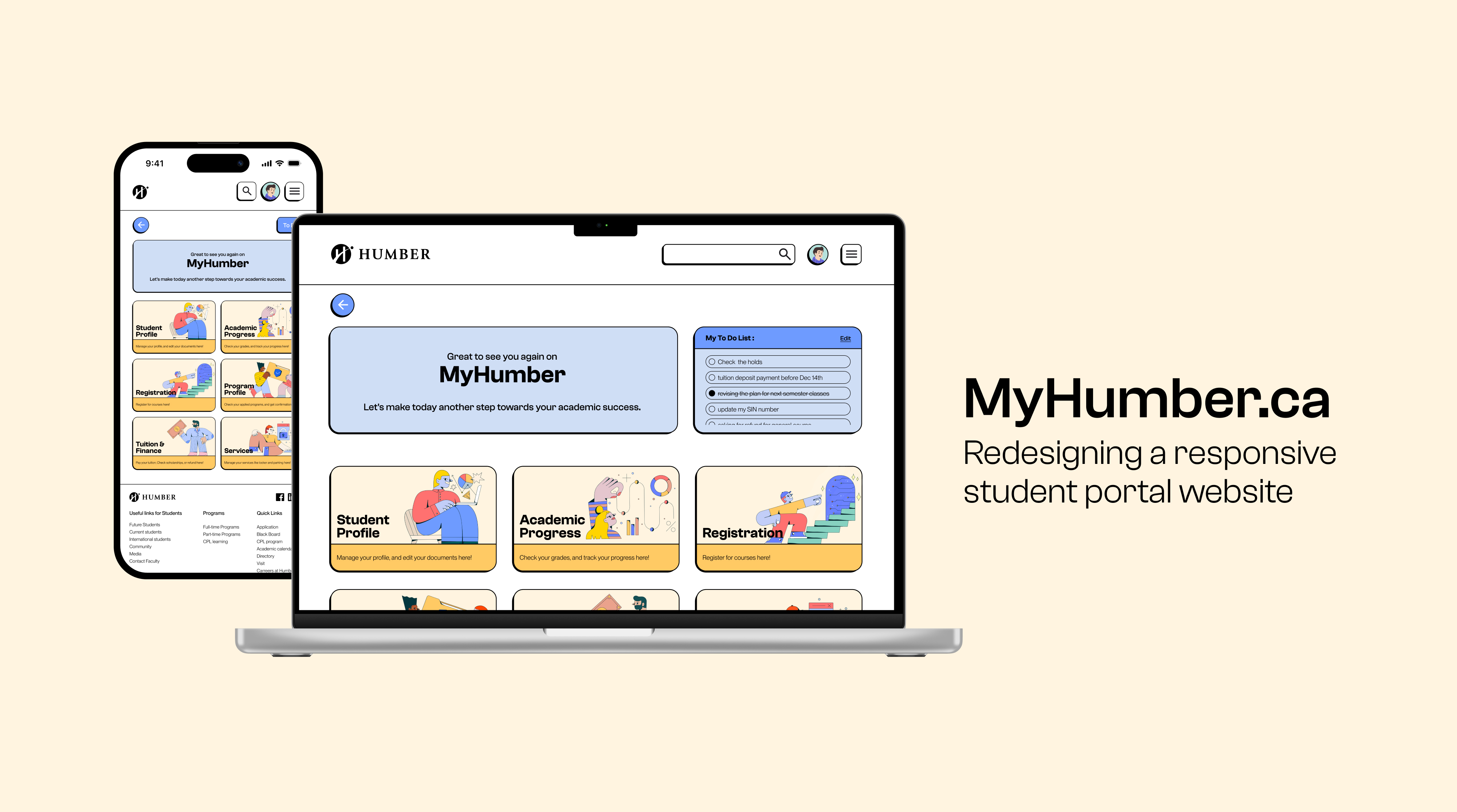
Redesign of a Student Portal Website
Role
- UX Audit
- UX Redesigner
- UI Redesign
Tools Used
- Figma
- Adobe Illustrator
Duration
- 6 Weeks
“ MyHumber.ca stands as the primary student portal for Humber College in Ontario, Canada. This pivotal platform serves as the central hub for student activities, enabling seamless registration, real-time tracking of academic progress, grade management, and efficient financial transactions, including tuition payments.
As a dedicated student of Humber College, I undertook the responsibility of reimagining this cornerstone portal. The objective was clear: to elevate the user experience and interface, ensuring a remarkable and intuitive digital journey for every student”.
Target Audience
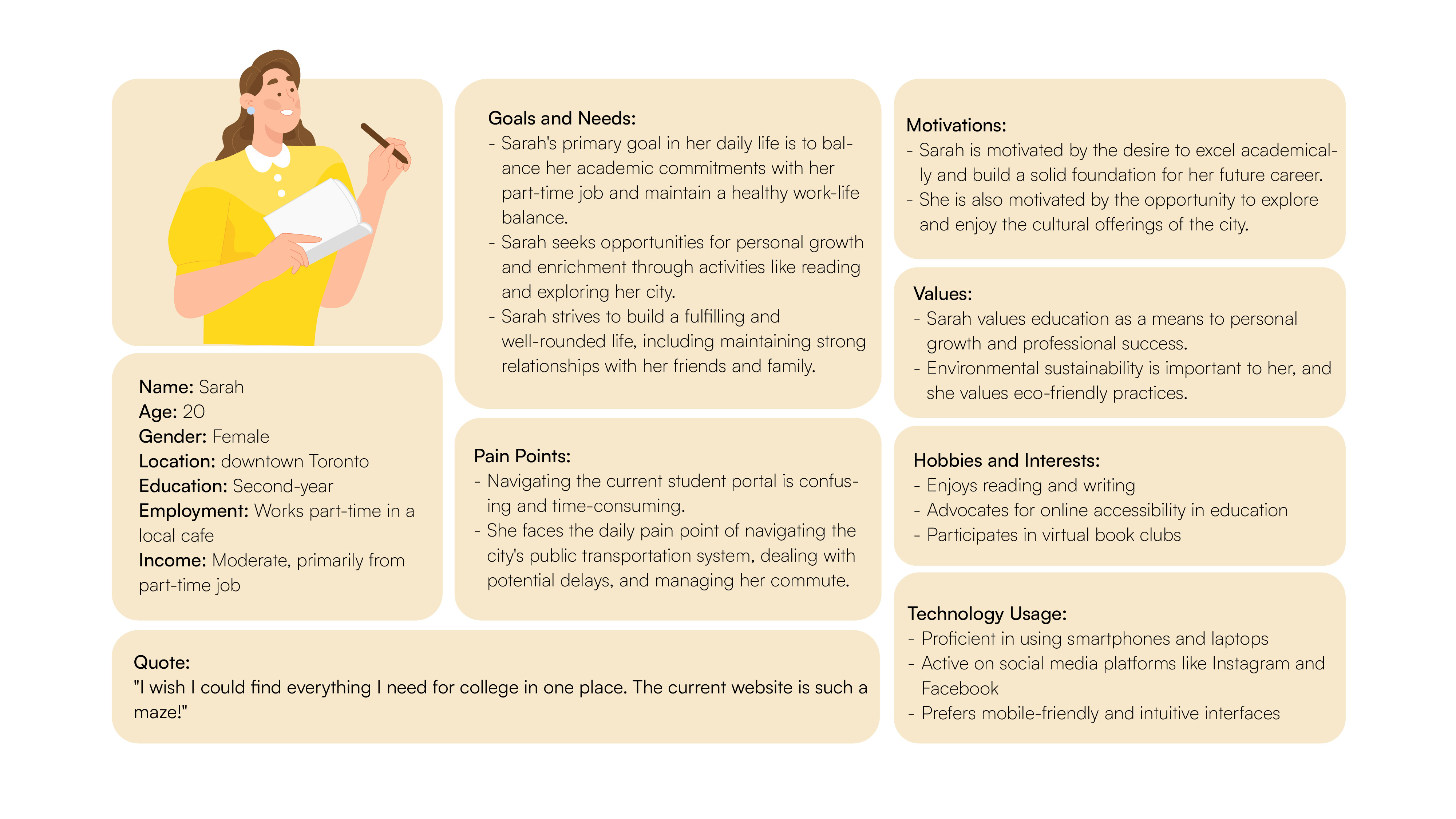
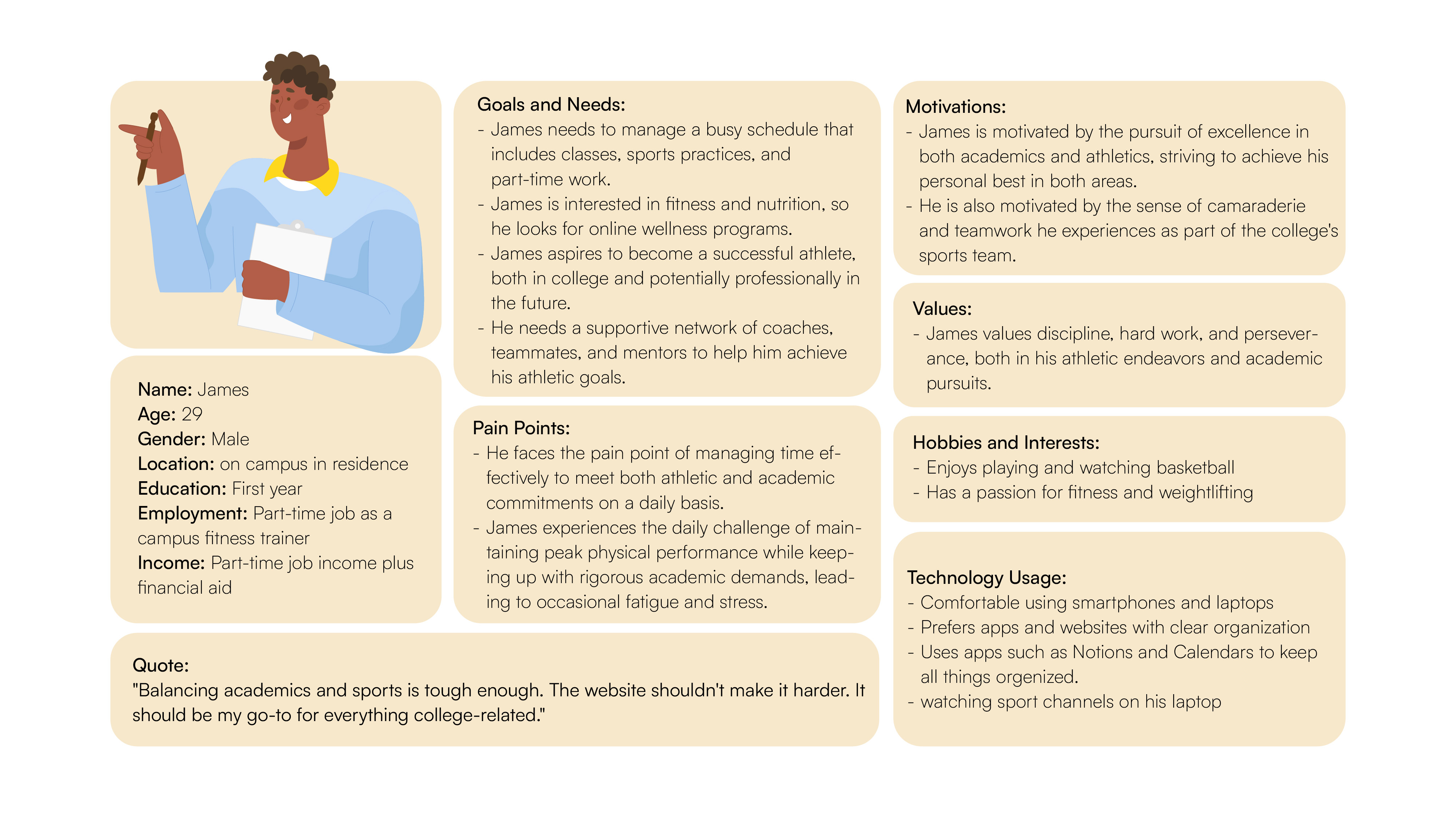
Since I am redesigning MyHumber website, the main target audience would be Current Humber students. All Humber students regardless of their program should sign in to the website and handle/manage their basic student needs through that.
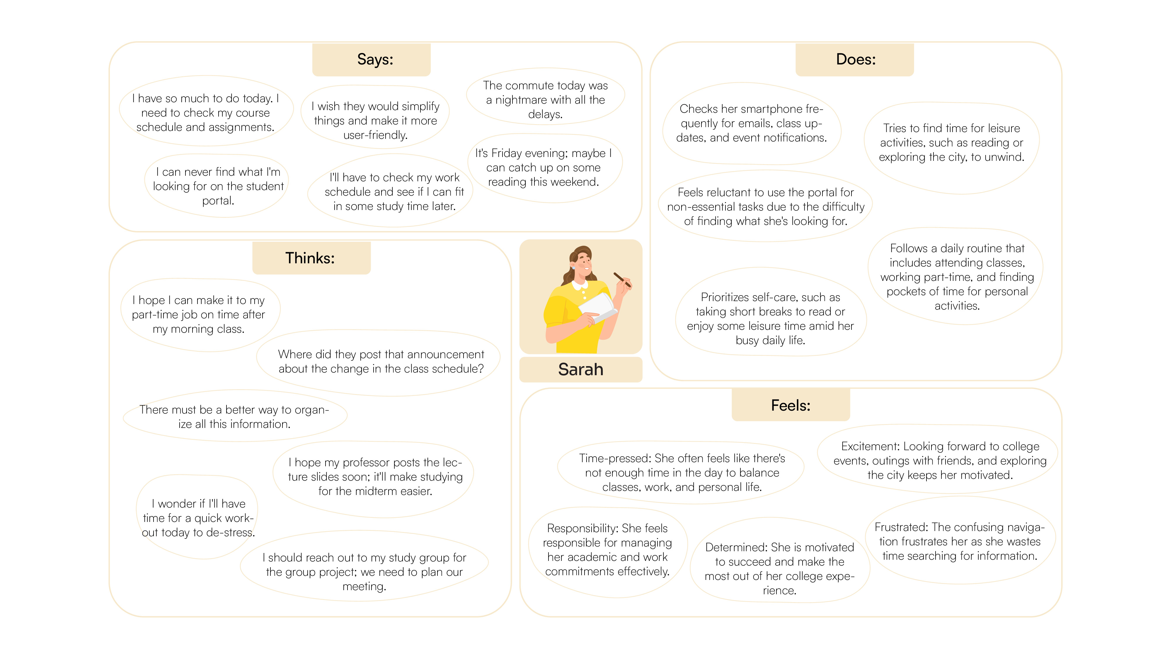
Empathy Map
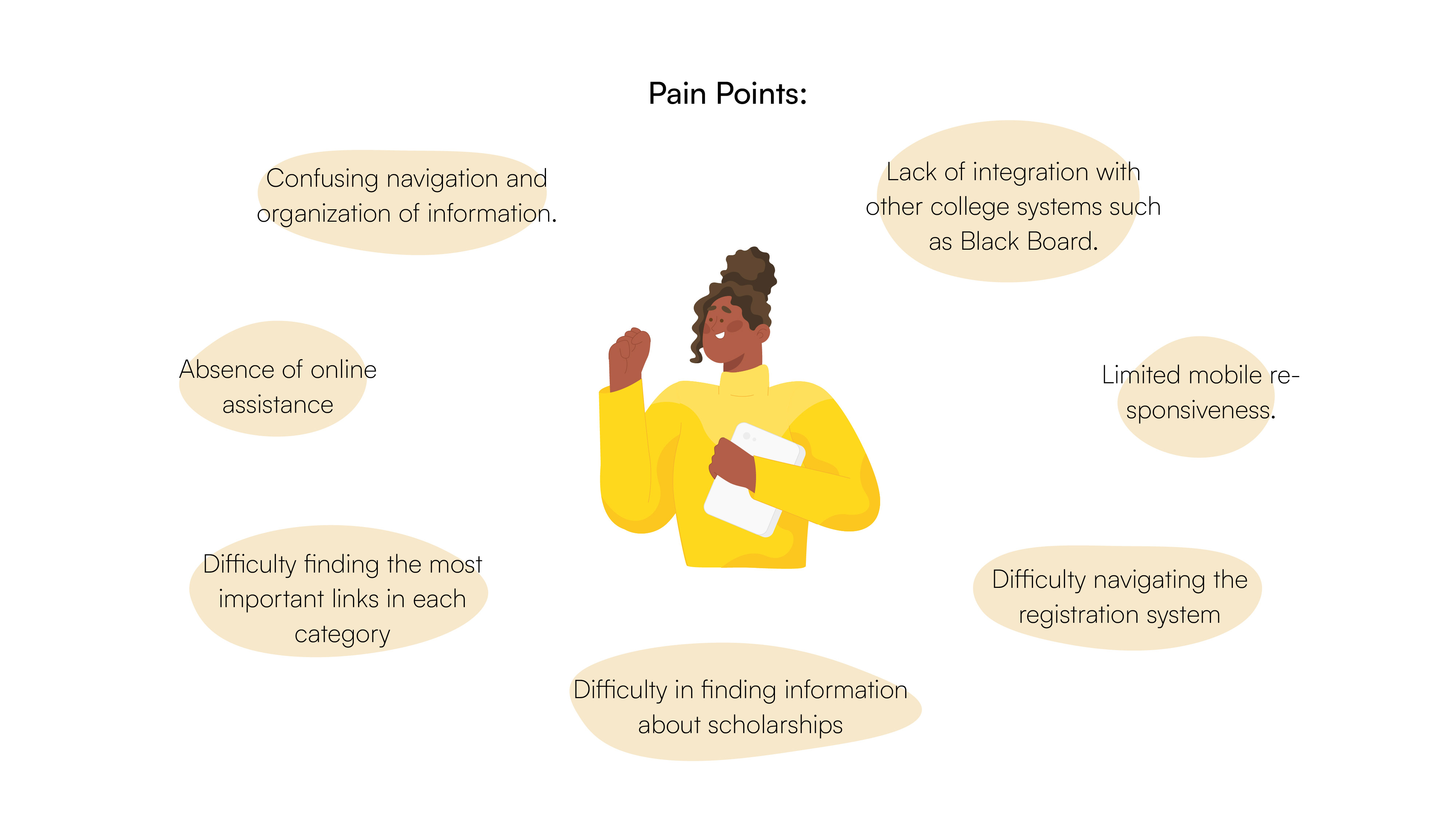
Pain Points
Problem
“One of the primary challenges lies in the navigation experience on the MyHumber website. Students often encounter difficulties, leading to confusion and time loss in locating the right links to accomplish tasks.”
UX Audit
Usability and Navigation:
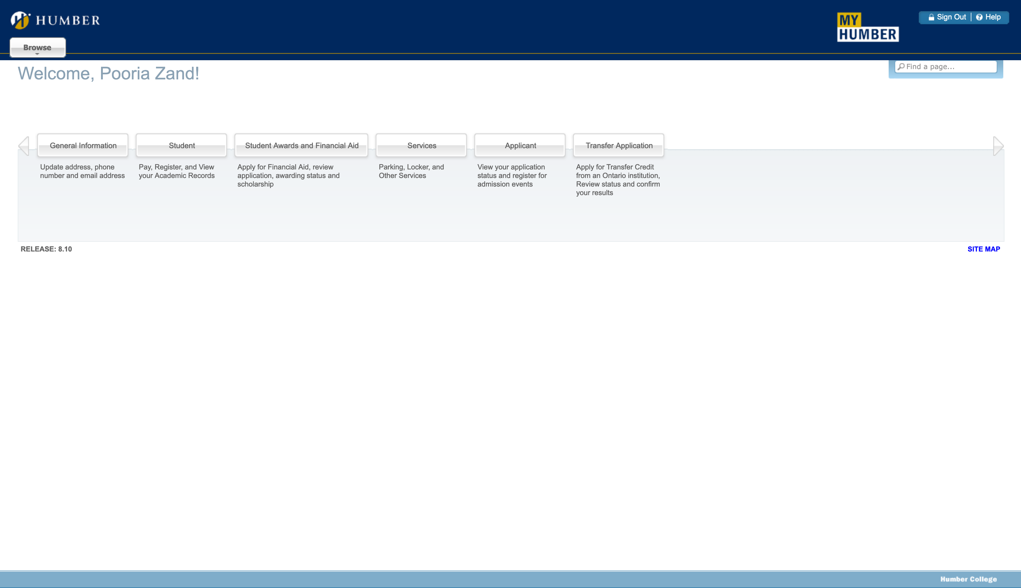
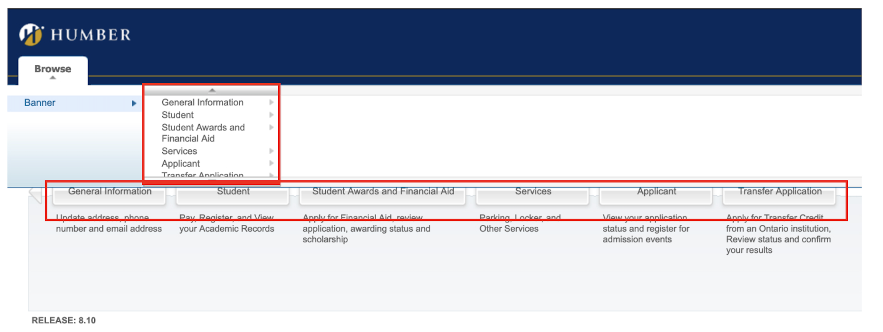
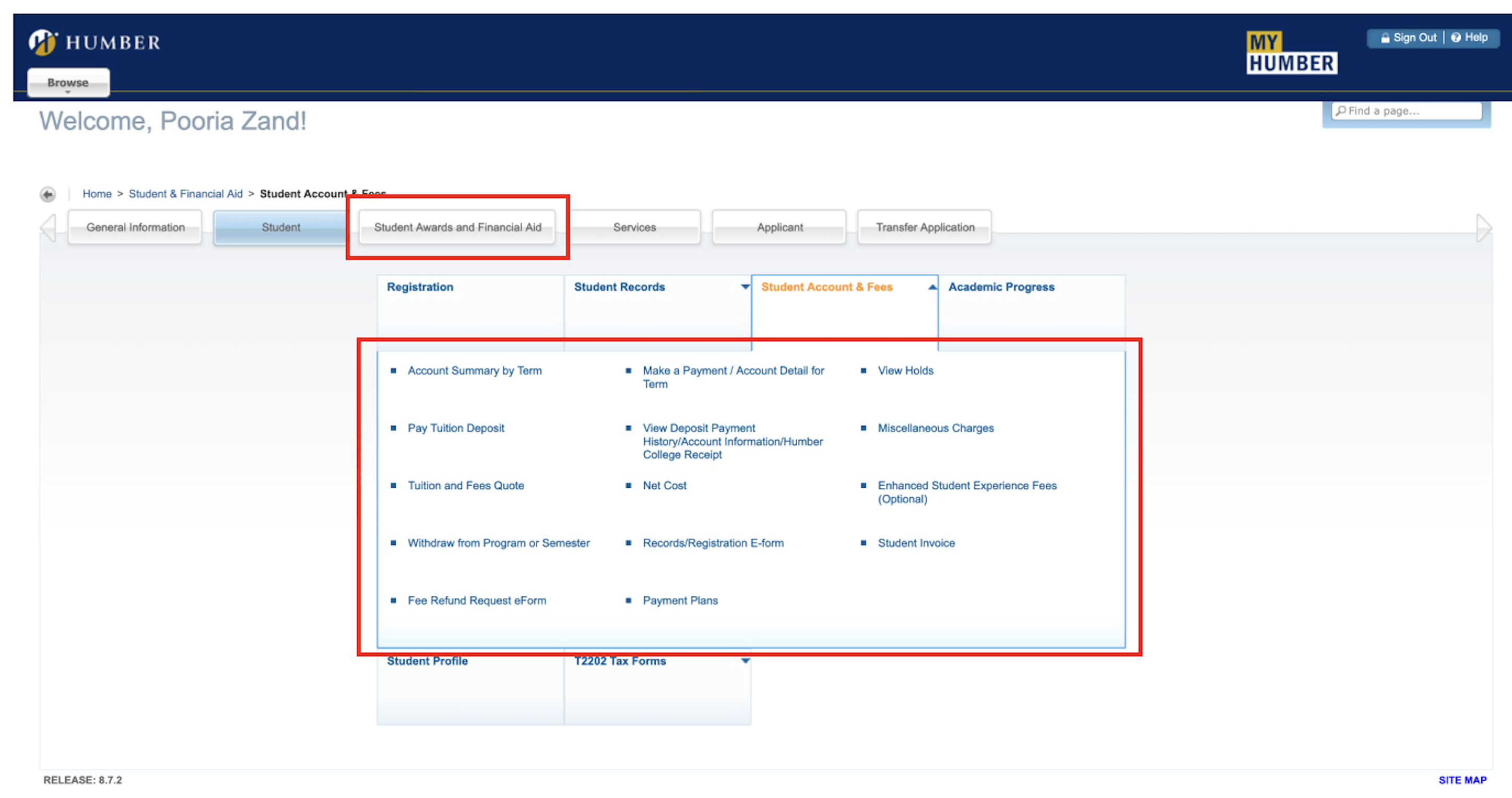
Navigation is easy and difficult at the same time! And it is because you can have access to the same pages via different links/buttons, it looks confusing.
The browse button on the top left corner is useless since you can see all those navigation links bold and clear on the main page, and also when every single new link is opened, you still have the main navigation items on the top of the page.
The main navigation items are not properly named, or their subdivision sections should not be located there! For example, the students' financial section (tuition payment, payment history, invoices, etc.) can be in a separate category besides “student financial aid”.
The search button is small and shy sitting in a corner! But it works properly and finds the searched items.
In terms of hierarchy, when you open up each category, you can not figure out which item may be more important, and they look at the same level of importance.
Visual Design:
No any obvious design pattern.
only one typeface has been used, but in terms of font size, thickness, and color, they don’t look to be based on any specific pattern.
Buttons` 3D effect looks very old-fashioned and low resolution
position and sizing of items like Sign out/help button, and also search box are not proper
Accessibility:
The page is not accessible by the keyboard buttons. I couldn’t navigate between all items and I only was able to select main headings by arrow keys.
The contrast between texts and backgrounds is good, and it passes the contrast checks. But for the main buttons (navigation elements) the grey text on the grey background looks a bit poor in the contrast exam.
Framing the design challenge
What is the problem you are trying to solve?
The problem I am trying to solve is the difficulty a student faces while navigating through the MyHumber website, which causes confusion and losing time, finding the right link to get a task done.
Frame the problem as a design question.
How can we make the website more user-friendly?
State the ultimate impact you are trying to have.
To make the website more user-friendly and easier to use, by designing a better navigation, or redesigning the site map.
What are some possible solutions to your problem?
a) Redesigning the site map for better access to all items
b) recategorizing the sections
c) engaging visual elements to make things clearer for the users
d) engaging a better naming system to reduce the chance of confusion
e) integrating the website with other student-based websites/applications such as BlackBoard
f) making frequently-used links/items bolder and clearer
Rewrite your design question with more detail.
To make the website more user-friendly and easier to use, by designing a better navigation, or redesigning the site map.
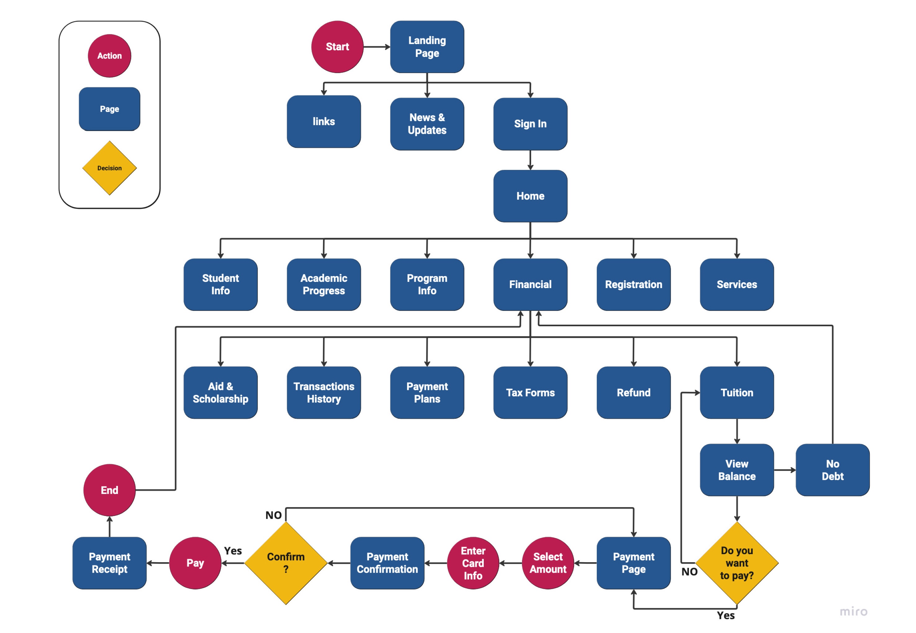
User Flow
UI Kit
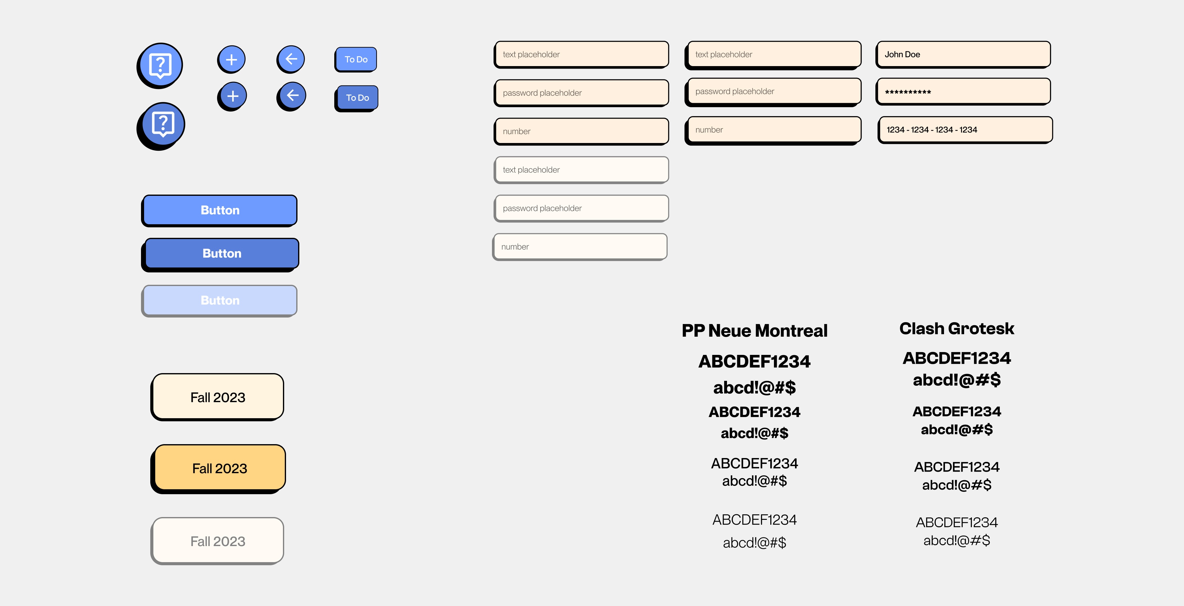
Wireframes

Design Features
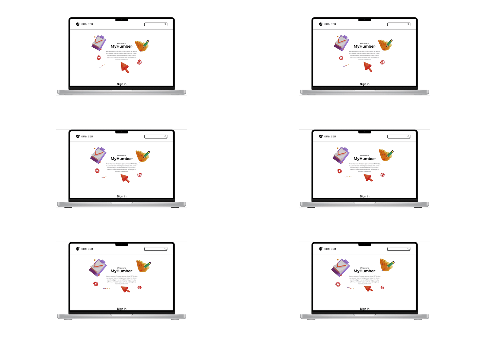
Landing page motion
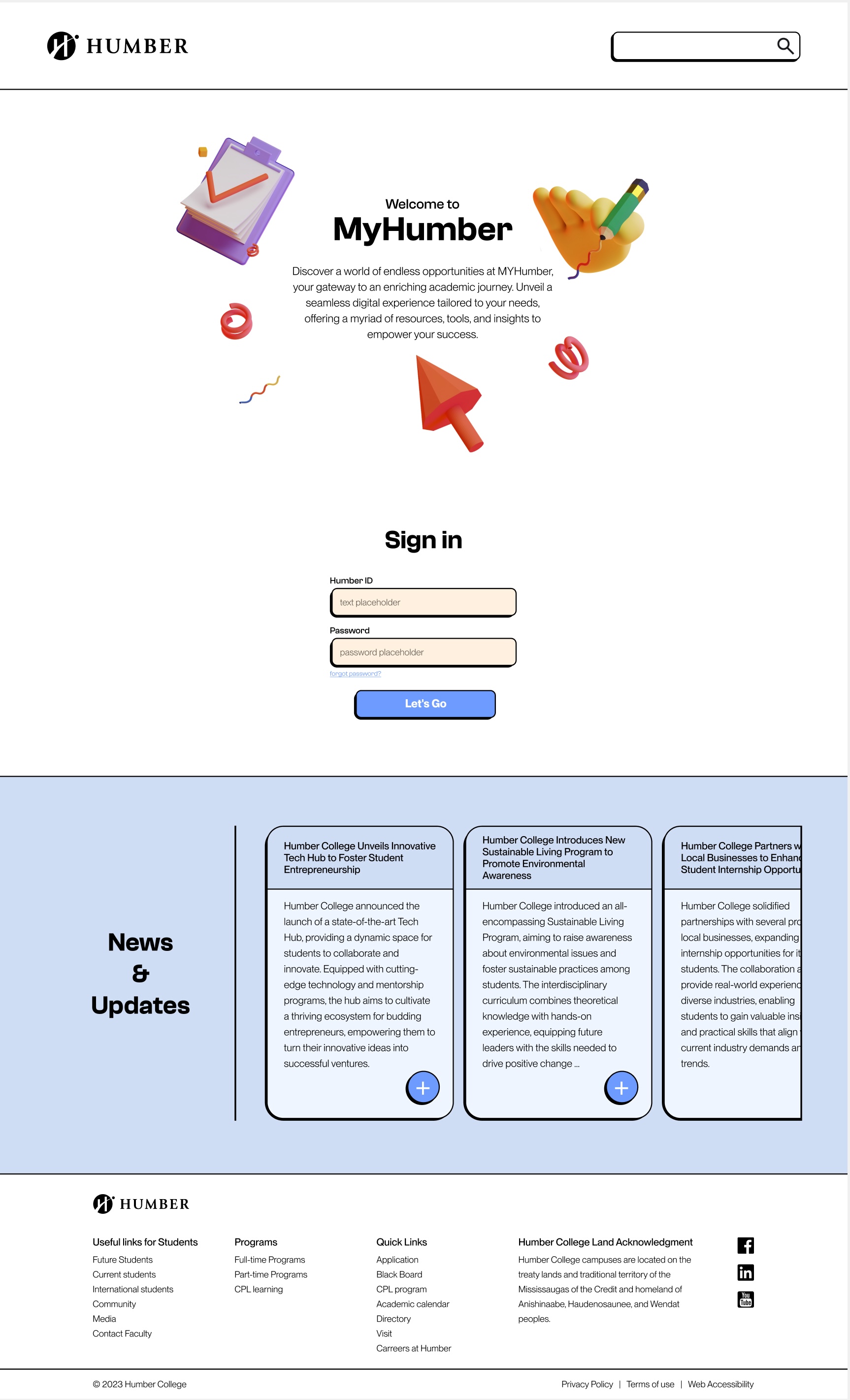
To captivate users and inject a touch of visual delight into the design, subtle motion featuring school-related items gracefully animates beside the MyHumber logo on the landing page.
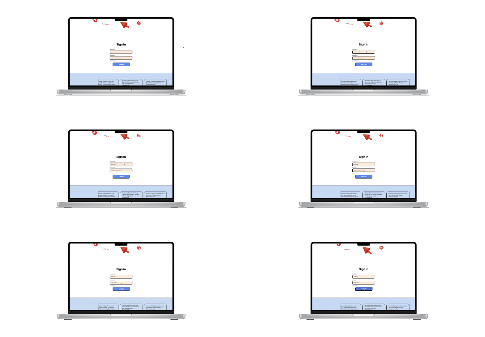
Sign-in form
The sign-in process is intentionally designed to be both simple and user-friendly. Delightful hovering effects on form labels and the submission button contribute to an enhanced user experience, blending functionality with visually pleasing effects.
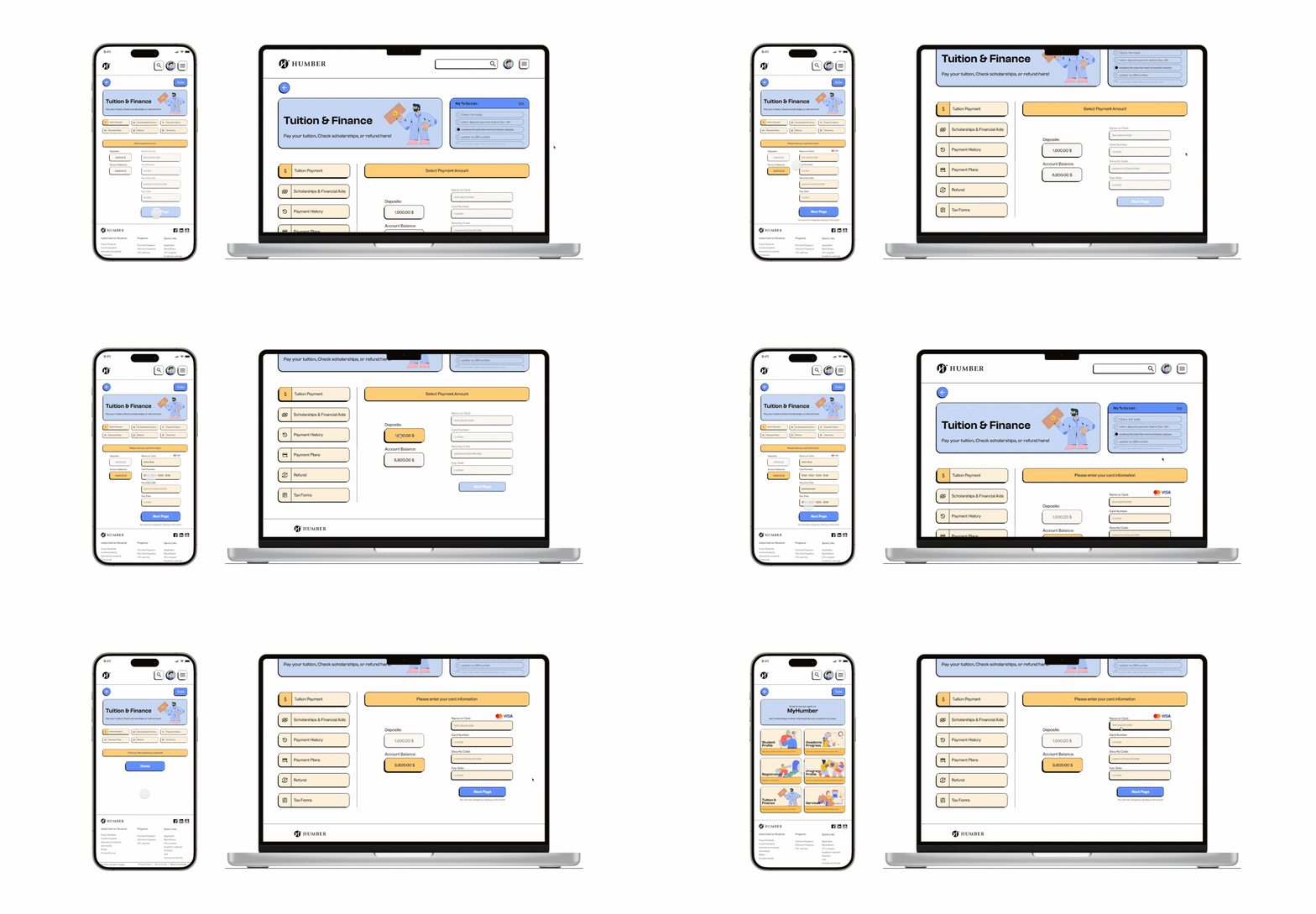
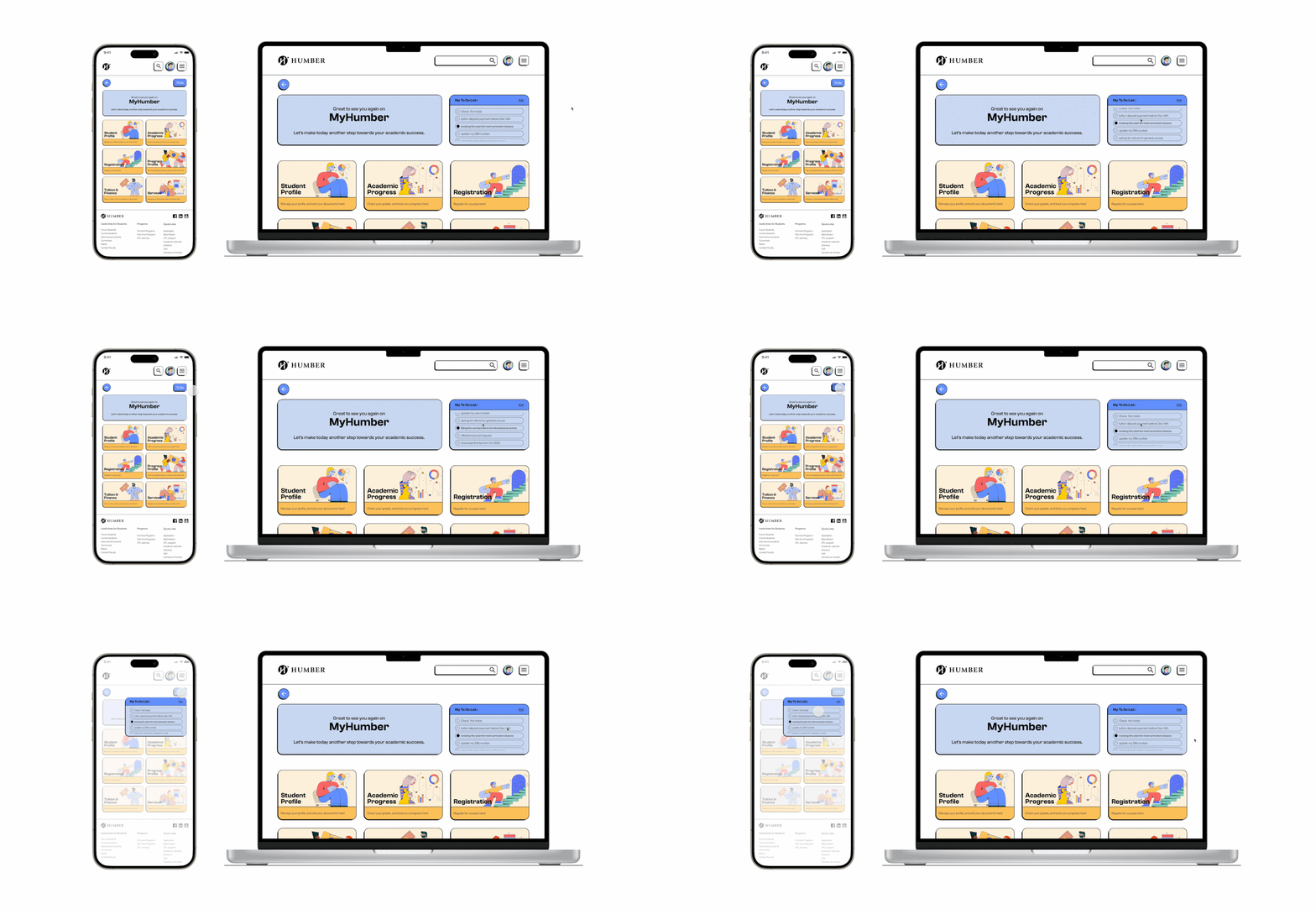
Responsive design
Every page and flow has been adjusted to ensure optimal responsive design. This approach guarantees a uniform and consistent experience for users, whether navigating through processes on desktop or mobile.
To-Do list
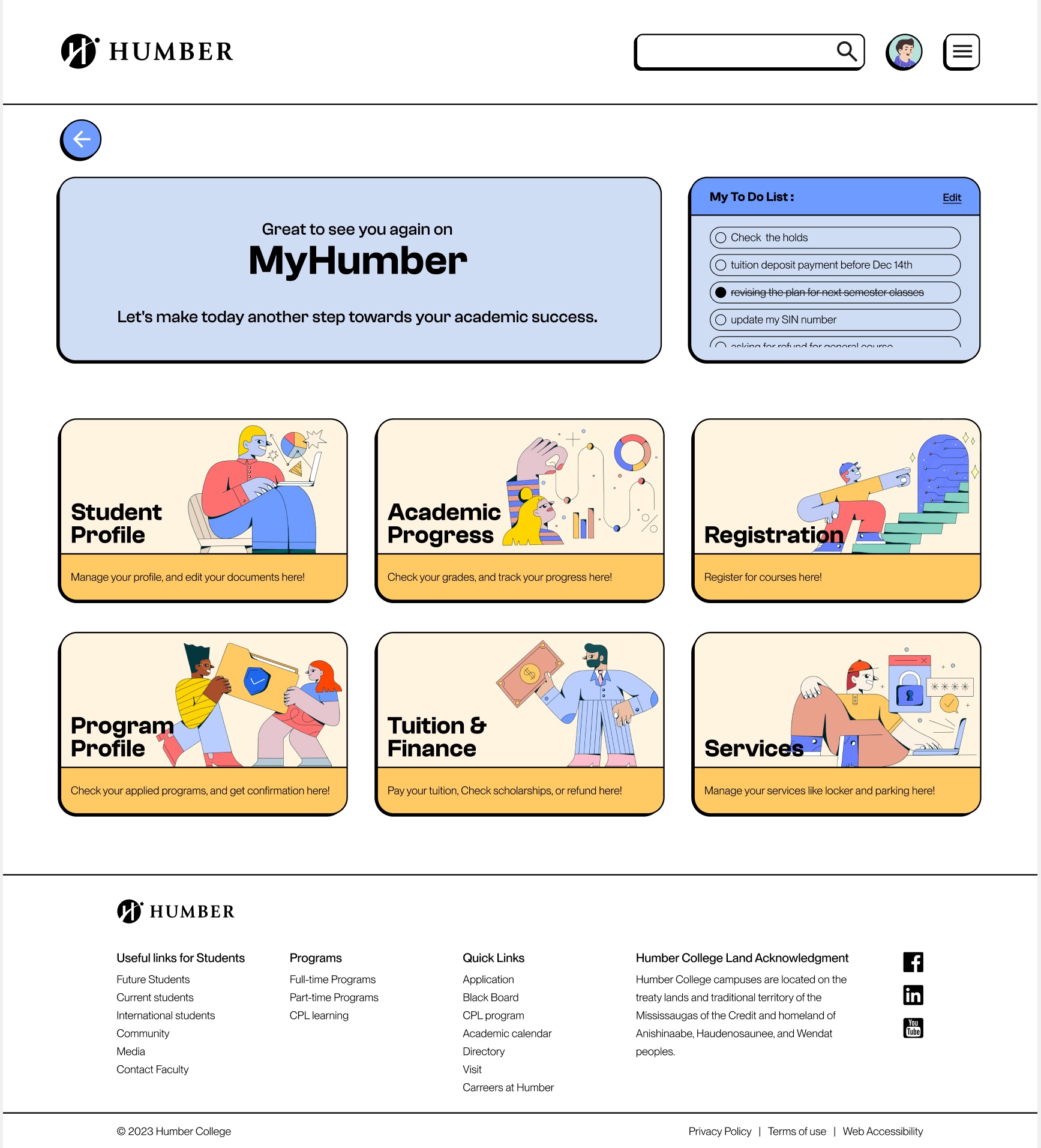
A standout feature of the website is the to-do list, designed to organize students' tasks as they navigate the platform. This list remains prominently pinned at the top, ensuring students never overlook crucial tasks. Given the myriad of career-related activities accessible on the site, this handy feature becomes an indispensable tool for meticulous task tracking.
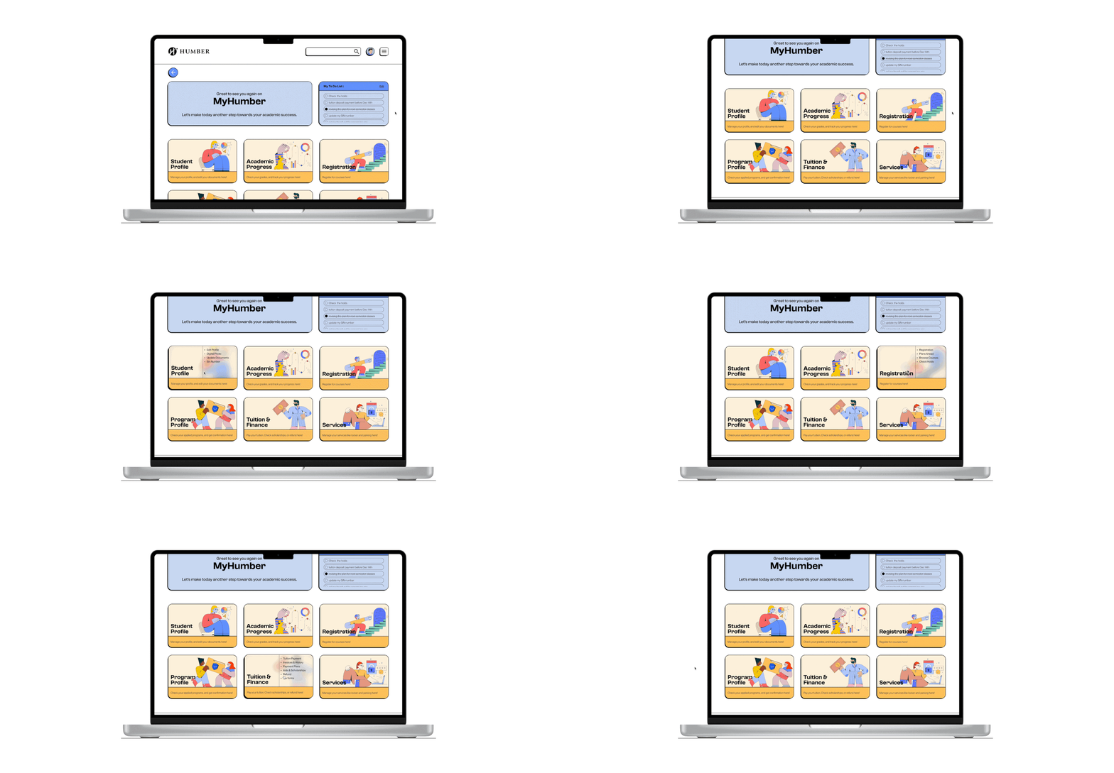
Cards with special hovering effects
The focal point of user practicality lies in the revamped secondary navigation, now presented as visually engaging cards. Infused with captivating graphics and thoughtful hovering effects, these cards provide an interactive gateway, showcasing all accessible links. Clicking on these cards seamlessly propels users to the next page, enhancing the overall navigational experience.
Original & redesigned Pages Comparison
Current Landing page
Redesigned Landing page
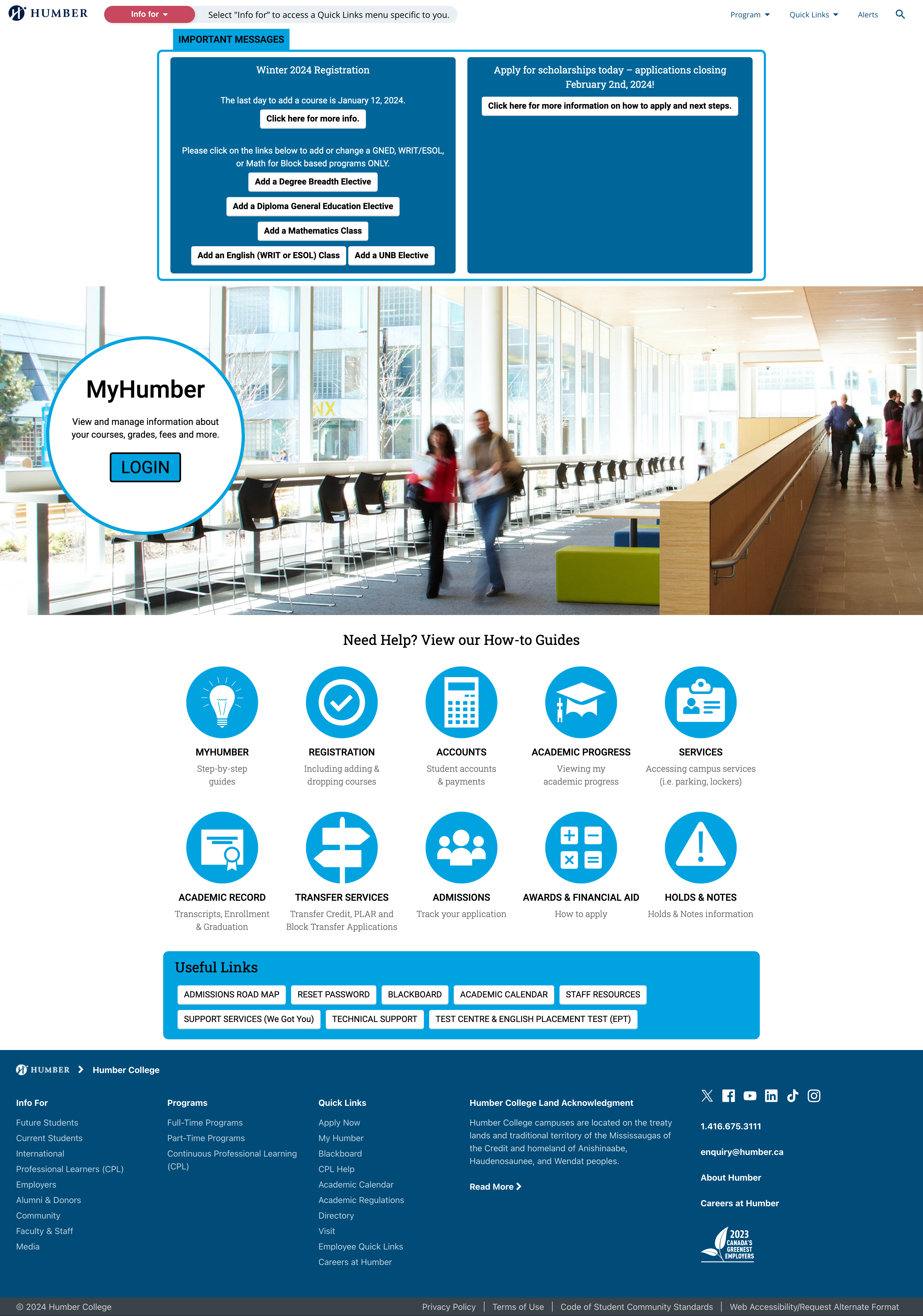
Current Home page
Redesigned Home page


Current Tuition Payment page
Redesigned Tuition Payment page
