A B2B Furniture Sourcing App for Interior Designers
Role
- UX & UI Designer
- Visual & Identity Designer
Tools Used
- Figma
- FigJam
- Adobe Illustrator
Duration
- 7 Weeks
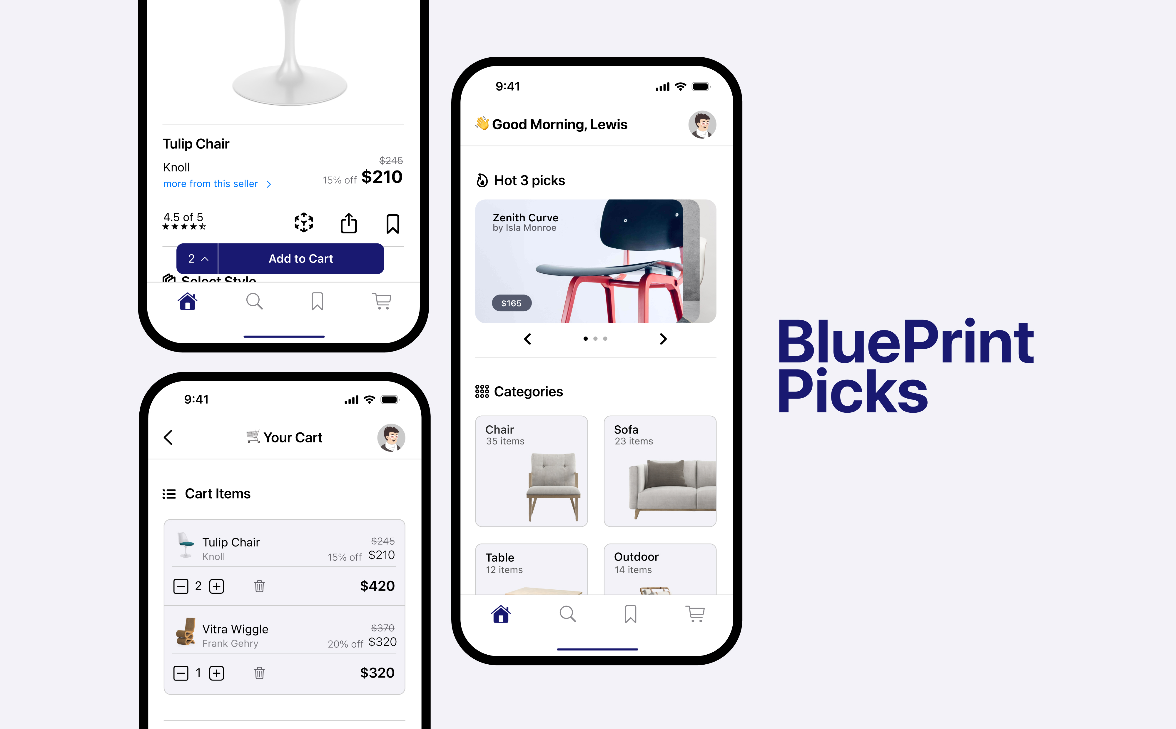
"BluePrint Picks is a native iOS app that streamlines how interior designers source and customize furniture. By moving beyond simple shopping, the platform allows professionals to tailor high-end pieces to specific project needs and organize them into dedicated collections, making it easy to manage multiple clients in one seamless workflow."
01. Discovery & Research
To design an effective tool for professionals, I needed to understand where current e-commerce platforms fall short for the interior design workflow. I focused on identifying the gap between "browsing for inspiration" and "specifying for a project."
Market Positioning & Business Model
BluePrint Picks is positioned as a B2B vertical commerce platform, where value is driven by professional purchasing volume rather than individual consumer transactions. By offering a dedicated suite of professional tools, the platform incentivizes interior design firms to keep their entire sourcing and procurement workflow within a single ecosystem, increasing purchasing frequency and long-term platform adoption.
Research Methodology
I conducted a competitive audit of leading furniture platforms and performed qualitative interviews with three practicing Interior Designers. My goal was to map their journey from discovery to purchase.
Competitive Audit & Pattern Research
I analyzed leading retail apps such as IKEA, Etsy, and Canadian Tire to identify best-in-class mobile patterns. Although these platforms serve broad consumer audiences, they offered a strong functional reference for defining the core mechanics of my app.

Lessons Learned & Applied:
Onboarding & Identity: From IKEA, I studied the minimalist vision and how to introduce complex features like AR without overwhelming the user during the first launch.
Categorization & Navigation: I analyzed Canadian Tire to understand how to handle massive inventories through logical categorization and overlay-style menus that keep the user's context.
Organization Patterns: Etsy's "Saved Items" provided the foundation for my collections, though I realized their system was too simple for professional project management.
Trust & Transaction: I audited the log-in and checkout flows of all three to ensure my app purchase experience felt secure, fast, and familiar.
The Professional Gap: The audit revealed a major opportunity: While these apps are excellent for buying a chair, none of them allow a professional to manage five projects simultaneously. My challenge was to take these polished retail patterns and adapt them for a multi-project professional workflow.
User Discovery
I conducted early-stage exploratory interviews with three practicing interior designers to understand how they currently move from inspiration to specification.
The goal was not statistical validation, but to surface workflow patterns, language, and decision-making behaviors that could inform early product direction.
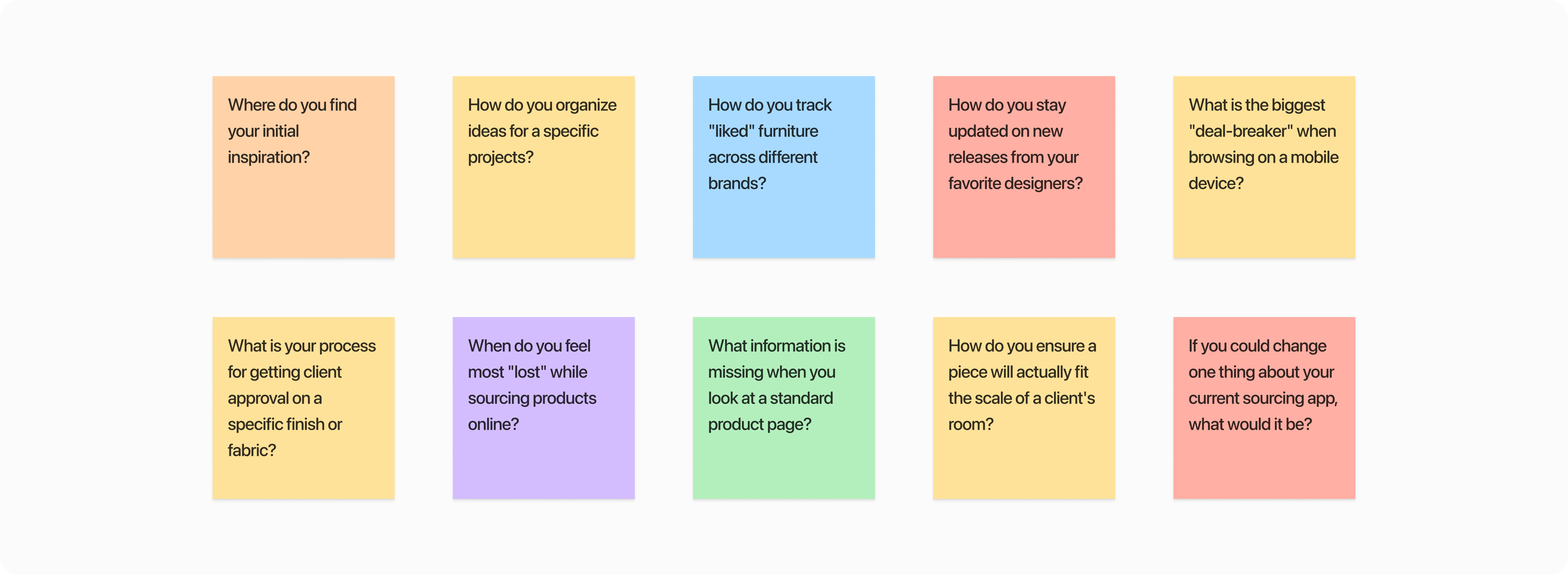
Key Friction Points
After analyzing the interview transcripts, three primary "Pain Points" emerged that defined the product's direction:
Workflow Fragmentation: Research showed designers frequently switch between disconnected tools for inspiration, organization, and purchasing, resulting in fragmented, inefficient workflows.
Customization Limitations: Participants reported limited confidence in purchasing due to the lack of real-time material and finish visualization, which is critical for professional accuracy and client validation.
Scale & Spatial Uncertainty: Findings indicated strong hesitation around large-item purchases without spatial context, often leading to cart abandonment or post-purchase returns.
02. Defining the Strategy
To translate research into a functional app, I moved away from static personas and focused on Jobs to be Done (JTBD). This framework allowed me to design for the designer's intent rather than just their demographics.
The Core "Jobs"
Based on the interview insights, I identified three primary "Jobs" that Blueprint Picks needed to fulfill:
Job 1: Professional Organization
When I am sourcing products for multiple clients, I want to organize items by project within the app, so I can manage selections without relying on external tools or manual syncing.
Job 2: Precise Specification
When I identify a furniture piece that aligns with a client's style, I want to adjust materials and finishes in real time, so I can confidently present a validated option for immediate approval.
Job 3: Spatial Validation
When evaluating a high-value item for a client's space, I want to visualize its true scale in the room using AR, so I can reduce uncertainty and ensure proper fit within the layout.
03. Mapping the Experience
I mapped the user's journey to pinpoint exactly where "Manual Syncing" and "Spatial Uncertainty" break the professional workflow. This visualization allowed me to identify high-impact design opportunities.
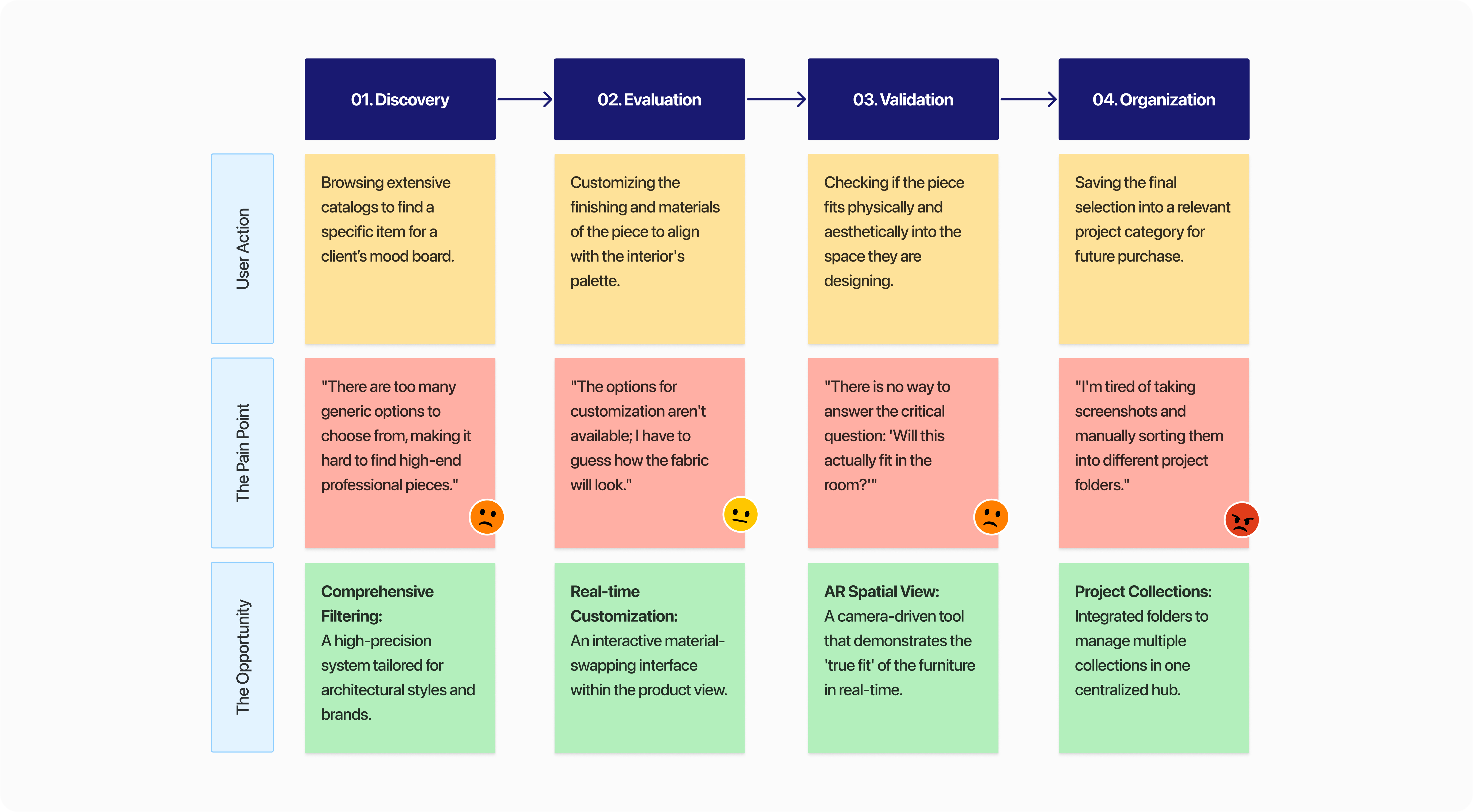
Design Reframing: From General Shopping to Professional Sourcing
The user journey map revealed that designers consistently struggle with the absence of professional-grade tools within standard mobile shopping flows. Key moments of friction—particularly during discovery, evaluation, and decision-making—forced users into a fragmented “screenshot-and-save” workflow outside the app.
To transition the experience toward a unified “source-and-specify” process, three design interventions were prioritized:
Precision Discovery: Replacing generic search with a high-fidelity filtering system tailored to architectural styles and professional criteria.
Instant Specification: Reducing material uncertainty by enabling real-time customization of finishes and materials during evaluation.
Project-Based Organization: Addressing workflow fragmentation by allowing designers to organize and manage furniture selections across multiple projects within a centralized workspace.
Defining Success (Success Metrics)
To validate the impact of these solutions, I established three hypothetical Key Performance Indicators (KPIs) to measure product success:
Efficiency: A 30% reduction in "Time-to-Project-Assembly" (measuring how fast a designer can move an item from discovery into a categorized collection).
Retention: Increased "Return User Rate" by transitioning the app from a one-time shopping trip to a daily-use utility for project management.
Conversion: A reduction in cart abandonment for high-value items, measured by the frequency of AR "Spatial Validation" sessions before checkout.
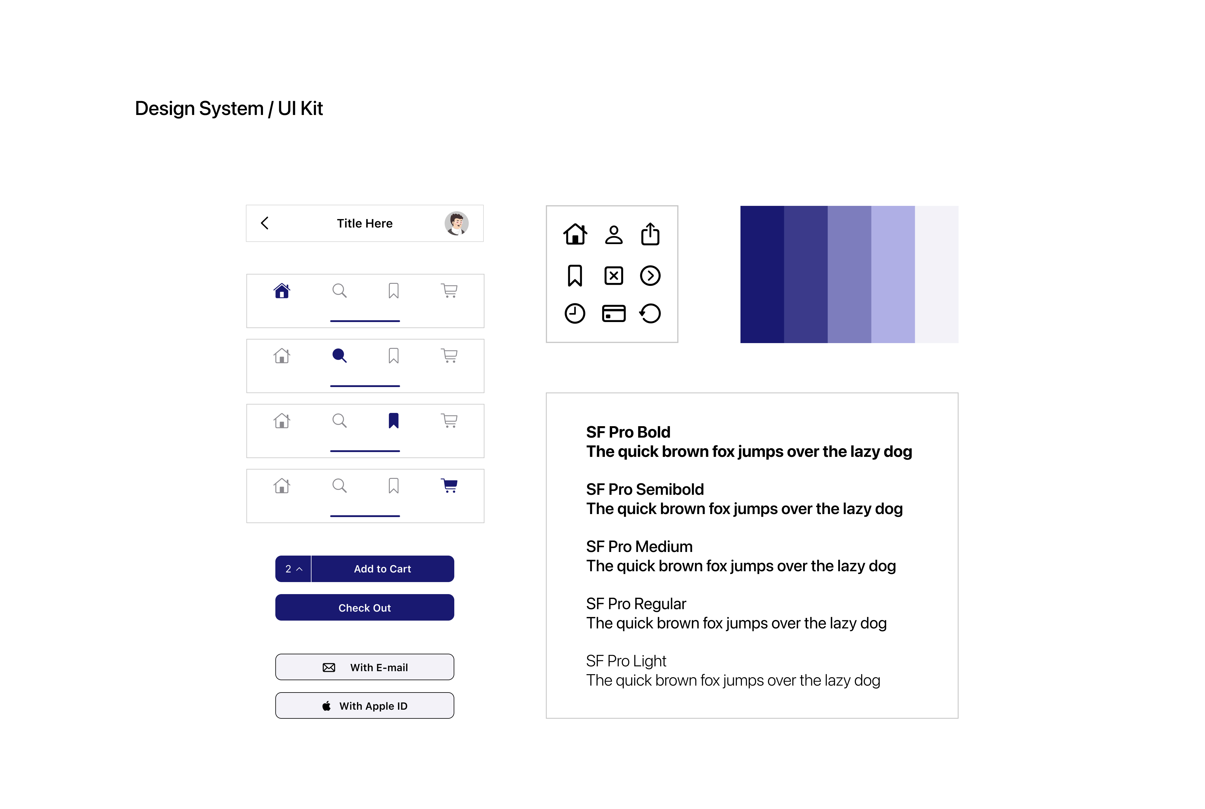
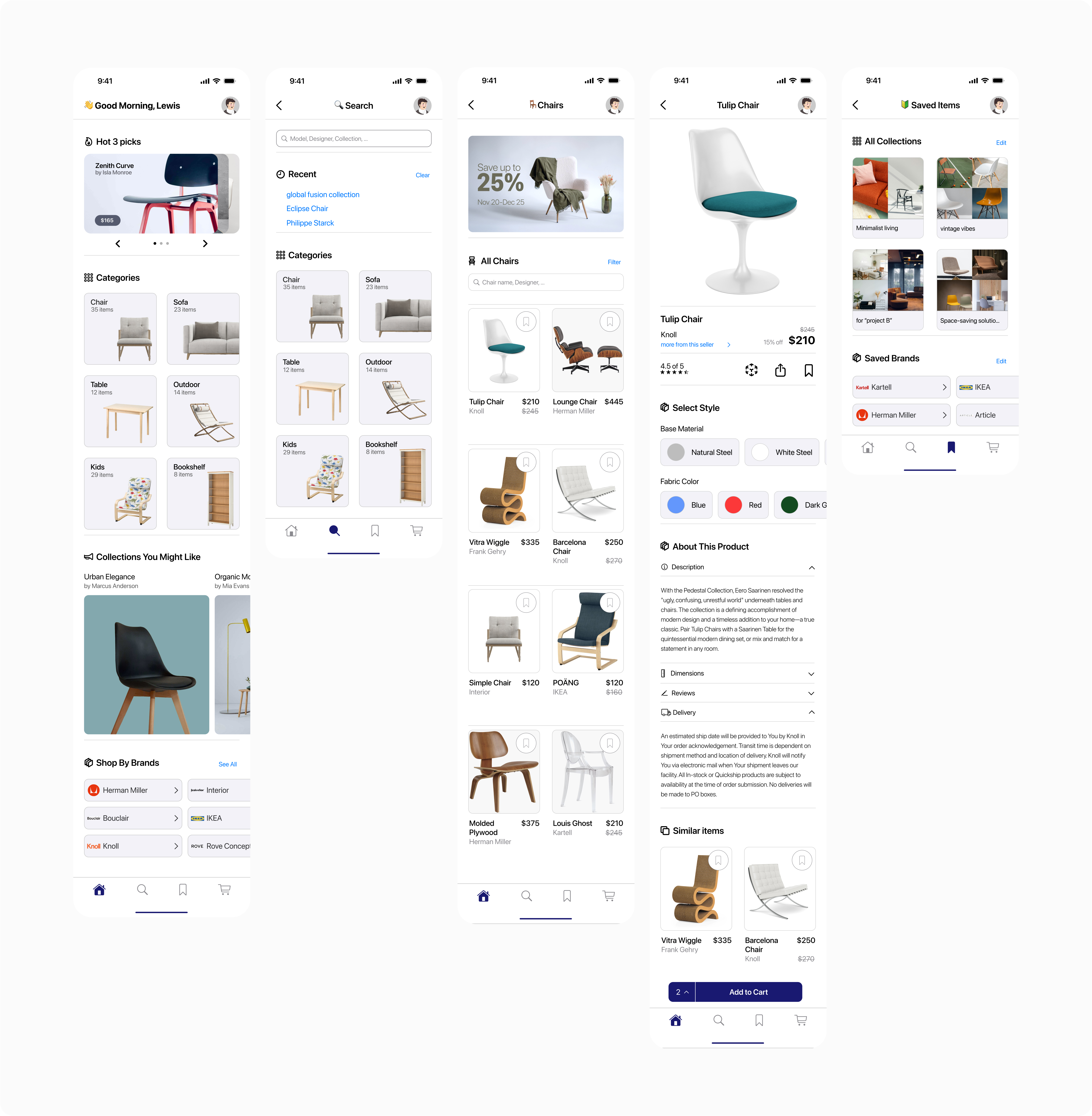
04. Visual Identity & Branding
Before moving into high-fidelity design, I developed a brand identity that would resonate with a professional audience. The goal was to create a "Gallery Aesthetic", a UI that feels premium but remains neutral enough to let the furniture designs take center stage.
The Name: BluePrint Picks
I chose "Blueprint" to evoke the architectural and planning phase of design. It signals that this app is a tool for building, not just a place for casual browsing. "Picks" adds a layer of curation, suggesting a professional standard of quality.
Visual Language
The Palette (The "Blueprint" Blue): I utilized a Deep Blue as the primary brand color. This shade was selected for its associations with professional trust, stability, and the classic "blueprint" aesthetic. It provides a sophisticated contrast against white backgrounds without being as harsh as pure black.
Typography (iOS Native): Since the app is designed as a native iOS experience, I utilized SF Pro. By sticking to the standard Apple system font, I ensured maximum legibility and a "built-in" feel. This choice leverages the user's existing muscle memory and familiarity with the iOS ecosystem, making the interface feel intuitive from the first tap.
UI Philosophy: I followed a "Gallery Minimalist" approach. The interface uses generous white space and thin-stroke icons to ensure the UI never competes with the product photography.
05. Design Execution & Iterative Refinement
1. Project-Based Collections
The Goal: To allow designers to manage multiple clients simultaneously without getting lost or resorting to external folders.
The User Flow & Logic:
I designed a flow that prioritizes immediate categorization. Unlike standard retail apps where you "Like" an item and find it later in one big mess, Blueprint prompts the user to assign the item to a specific project the moment they interact with it.
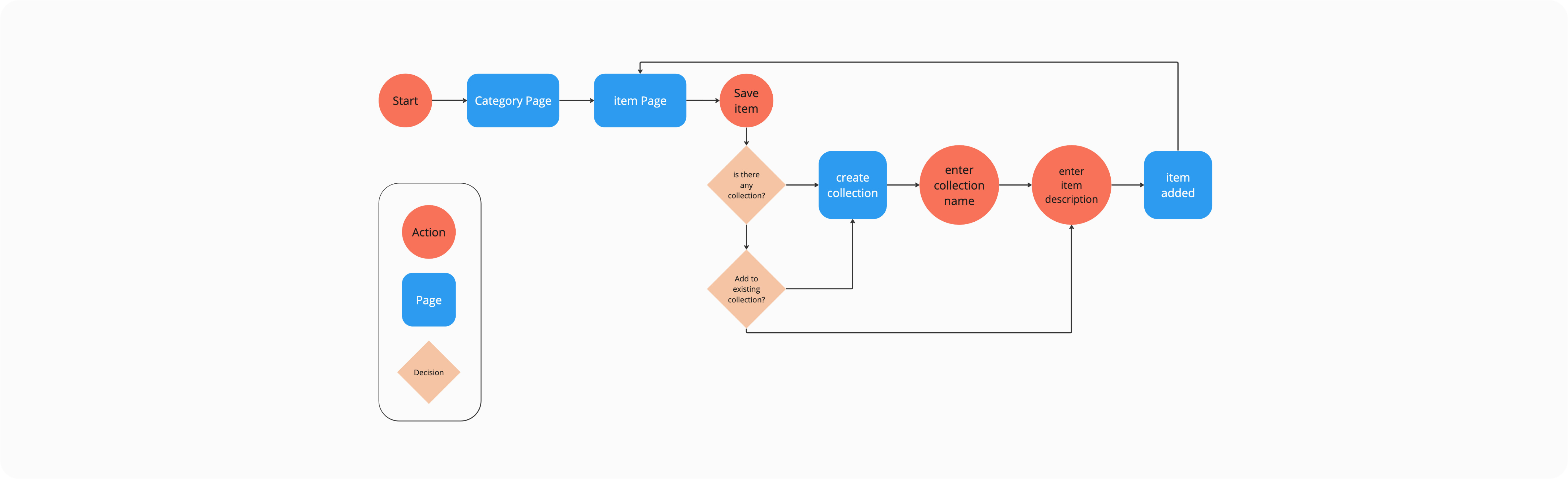
The Iteration Story:
In moderated usability sessions using a mid-fidelity prototype, designers were asked to save products for multiple hypothetical projects.
Several participants attempted to create a new collection mid-flow, revealing that folder creation needed to be accessible at the moment of saving, not as a separate setup step.
The Evolution:
I iterated the "Save to Collection" overlay to include a "Create a new collection". This prevents the user from having to break their search flow to go to their profile and set up a folder, keeping the sourcing momentum alive. This adjustment was validated in a second round of testing, where participants reported a significantly smoother experience when managing multiple client needs.
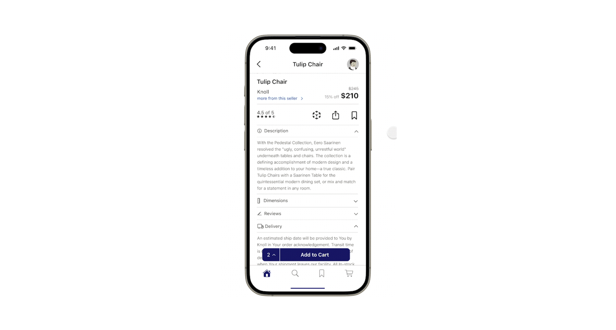
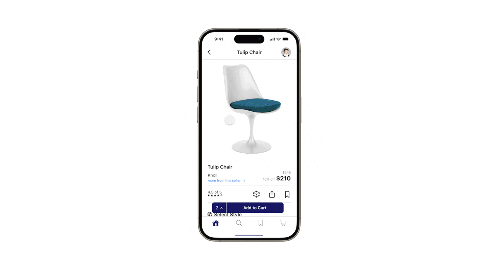
2. Real-Time Material Customization
The Goal: To eliminate the "Material Gap" and allow for instant client-ready specifications.
The Iteration Story:
During early iterations, material options were placed within a secondary “Details” section. Usability testing revealed that participants overlooked these options, often assuming the product was only available in the finish shown in the hero image.
The Feasibility Tension: A major constraint was the loading latency of high-quality 3D textures. Showing 10+ materials in real-time could crash the app.
The Trade-off:
I limited the real-time preview to the top most popular materials per item. This prioritized app speed (Performance) over an exhaustive list.
The Evolution:
I moved the Material Swatches to a primary position directly under the product image. I also refined the interaction so that tapping a swatch updates the 3D model instantly. This creates a "Decision-Support" tool where designers can virtually "build" the furniture with their client in real-time.
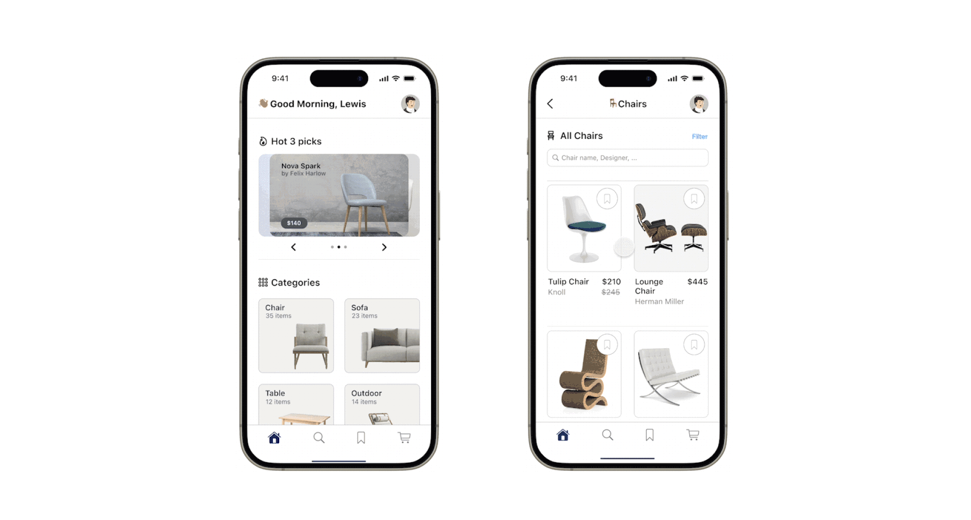
3. Comprehensive Search & Precision Filters
The Goal: To help designers navigate a massive catalog without "navigation fatigue."
The Iteration Story:
In my initial wireframes, I used a full-screen dedicated page for filters. However, during Usability Testing, users felt "disconnected" from the product list and found it annoying to toggle back and forth to see results.
The Evolution:
I iterated to a Semi-Transparent Overlay style. This allows the designer to see the product list updating in real-time behind the filter settings.
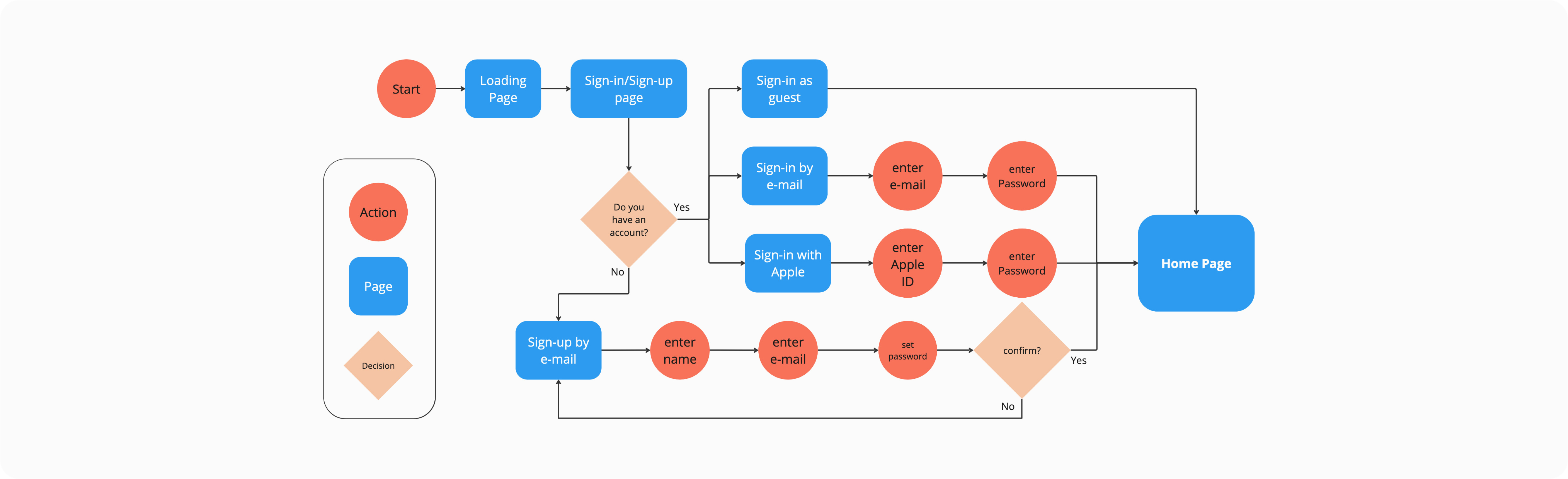
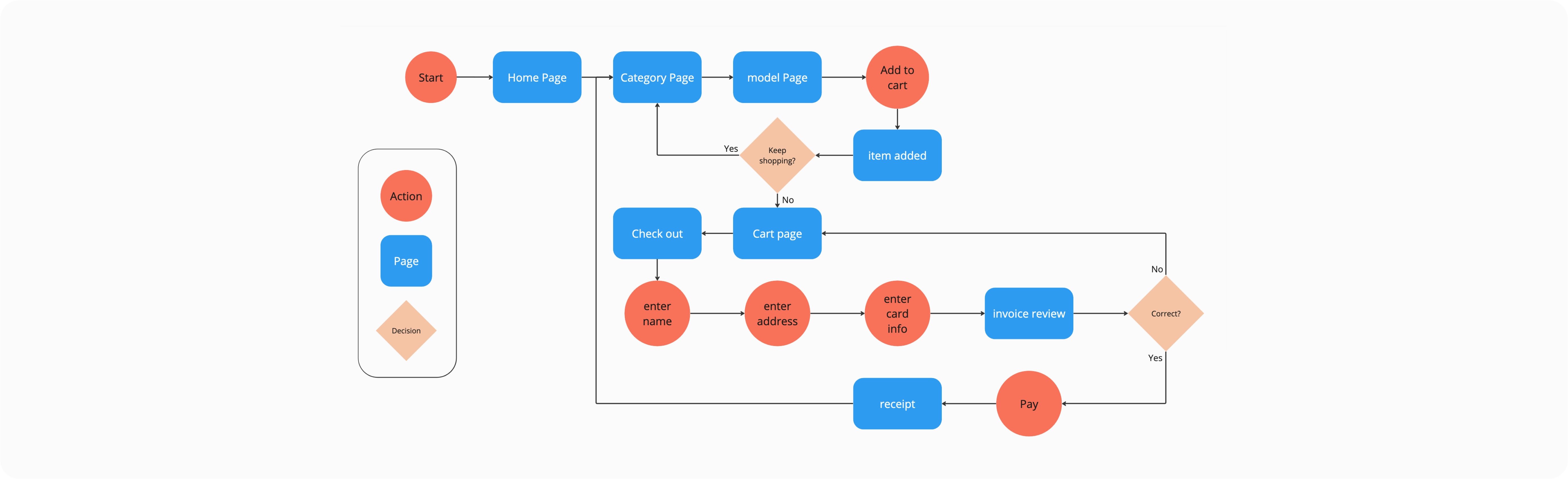
4. Completing the Ecosystem: Onboarding & Checkout
The Goal: To ensure Blueprint felt like a market-ready product, I mapped the "Bookend" experiences: Secure Onboarding and Professional Checkout.
Log-in/Sign-up Flow:
I focused on a minimalist entry to get the users to the main page as quickly as possible.
Purchasing & Payout:
I designed a streamlined checkout flow that handles professional billing details, ensuring the transition from "Designer Review" to "Final Purchase" is frictionless.
The Open Question: Is a mobile-first checkout enough for a $20k furniture order? In a real-world launch, this flow would likely require a 'Save Quote' feature to allow the designer to finalize the financial transaction on a desktop with their accounting team.
06. Reflection & Future Vision
The Impact: Blueprint Picks was designed to solve a specific business problem: Market Leakage. By centralizing the workflow, we reduce the risk of designers leaving the app to use external tools where they might discover competitors.
The final design creates a High-Trust ecosystem where real-time customization and AR validation serve as "Decision-Accelerators," potentially reducing the professional sales cycle and decreasing post-purchase return rates due to scale errors.
Key Learnings
Designing for Power Users: I learned that professional users value efficiency over "fluff." Features like the filter overlay and the "New Project" shortcut in the save flow were small UI additions that provided the highest user satisfaction because they respected the designer's time.
The Importance of Visual Fidelity: In the interior design world, "good enough" isn't enough. The success of the Customization and AR features relies heavily on high-fidelity textures, which taught me to design with technical asset constraints in mind.
The Limit of Mobile-First: One open question remains: Can a mobile app truly replace the 'Large Screen' experience required for mood-boarding? I am currently exploring whether this app should function as a standalone tool or if it is inherently a companion piece to a more robust desktop procurement system.
What's Next for Blueprint?
If I were to continue developing this project, my next steps would be:
1. Client Presentation Mode: A "view-only" link or mode where designers can share a specific collection with a client for feedback without showing wholesale pricing or backend notes.
2. Budget Tracking Integration:Adding a real-time budget calculator within the Project Collections to help designers track total costs as they add items.
3. Desktop Sync:While the mobile app is perfect for on-site sourcing, a desktop companion app would allow for more intensive project management and CSV exports for procurement.
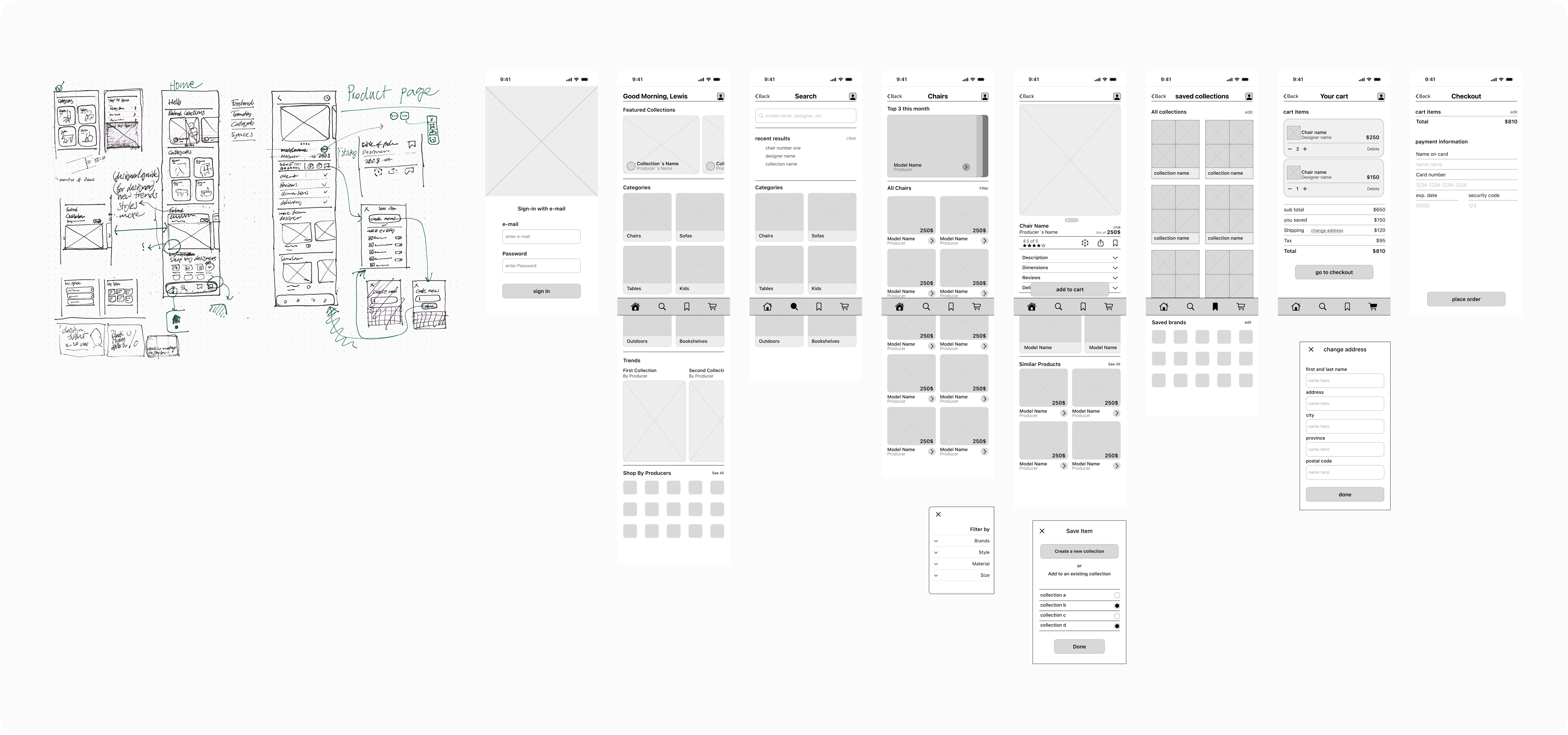
07. The Evolution: From Sketch to System
While the final interface is polished, the foundation of BluePrint Picks was built through rapid ideation and structural testing. This "Process Wall" shows the journey from raw concept to a refined, iOS-native environment.
The Design Evolution:
Every feature began as a paper sketch to prioritize layout and logic over aesthetics. Moving to mid-fidelity wireframes allowed me to test the Information Architecture and the 'Save to Project' flow before finally applying the high-fidelity branding and interaction layers shown throughout this case study.
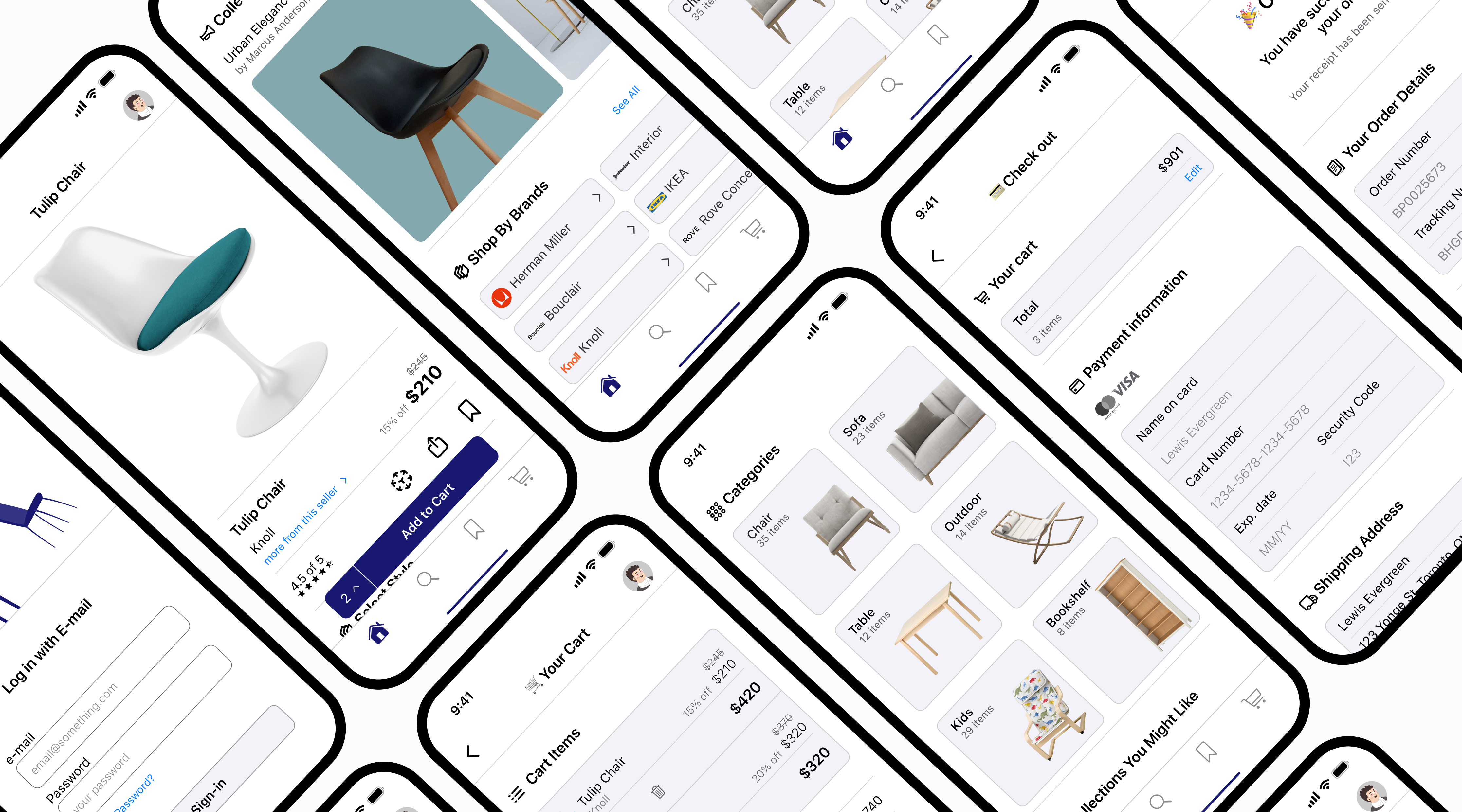
08. Prototype
The high-fidelity Figma prototype; you simply can sign in the app and check all the pages and flows at one place.